
SaaS companies with annual contract values under $10K lose 22-35% of their customers every year, according to aggregated KeyBanc and ChartMogul benchmarks. Mid-market ($10K-$100K ACV) companies lose 12-20%. That churn compounds. A B2B SaaS company at $3M ARR losing 25% annually needs to replace $750K in revenue just to stay flat. A customer health score dashboard turns that problem from reactive to predictable. You can build one in 48 hours.
What a Health Score Actually Measures
A customer health score is a composite metric that predicts whether a customer will renew, expand, or churn. It is not a satisfaction survey. It is a behavioral signal aggregated into a number.
Frederick Reichheld's research at Bain & Company, published in the Harvard Business Review, established that a 5% improvement in customer retention increases profits by 25-95%. That math still holds. The question is how you identify which customers are at risk before they cancel.
A functional health score weighs four signal categories, per customer success methodology from Velaris:
| Signal Category | Weight | What It Measures | |-----------------|--------|-----------------| | Product Usage | 35% | Login frequency, feature adoption depth, time-in-app | | Engagement | 20% | Response to emails, attendance at onboarding calls, webinar participation | | Support Activity | 20% | Ticket volume, ticket sentiment, resolution satisfaction | | Feedback & Sentiment | 25% | NPS responses, CSAT scores, qualitative feedback themes |
The 48-Hour Build (No Enterprise Software Required)
You do not need Gainsight at $60K+ annually or ChurnZero's enterprise platform to build a health score. You need a spreadsheet, your product database, and two days of focused work.
Hour 0-4: Define Your Signals
Pull data from three sources you already have:
- Your product database. Login timestamps, feature usage events, session duration. If you use Mixpanel, Amplitude, or even basic server logs, this data exists.
- Your support system. Intercom, Zendesk, or email. Count tickets per account per month. Note sentiment.
- Your CRM. Last touchpoint date, deal stage, renewal date, expansion pipeline.
Hour 4-12: Build the Scoring Model
Create a spreadsheet with one row per customer account. Add columns for each signal:
- Usage Score (0-100): Daily active users divided by total seats. Multiply by 100. A customer using 80% of their seats scores 80.
- Engagement Score (0-100): Count meaningful interactions (email opens, call attendance, feature requests) in the last 30 days. Benchmark against your median. Above median = 70+. Below = 30-.
- Support Score (0-100): Inverse of ticket volume. Zero tickets in 30 days = 90. Five+ tickets = 30. Adjust for sentiment: angry tickets reduce the score by 20 points each.
- Feedback Score (0-100): Most recent NPS or CSAT. NPS 9-10 = 90. NPS 7-8 = 60. NPS 0-6 = 20. No response in 90 days = 40.
Apply the weights: (Usage * 0.35) + (Engagement * 0.20) + (Support * 0.20) + (Feedback * 0.25) = Health Score.
Hour 12-24: Segment and Triage
| Health Score | Status | Action | |-------------|--------|--------| | 80-100 | Healthy | Expansion candidate. Schedule upsell conversation within 14 days. | | 60-79 | At Risk | Intervention needed. Assign CSM outreach within 7 days. | | 40-59 | Critical | Executive escalation. Personal call from founder within 48 hours. | | 0-39 | Emergency | Save or learn. If saveable, deploy your best resource. If not, conduct an exit interview. |
Hour 24-48: Automate the Dashboard
Move from the spreadsheet to a live dashboard. If you have data engineering resources, connect your product database to Metabase or Looker Studio. If you do not, set up a weekly Zapier flow that pulls the four signal data points into a Google Sheet with conditional formatting.
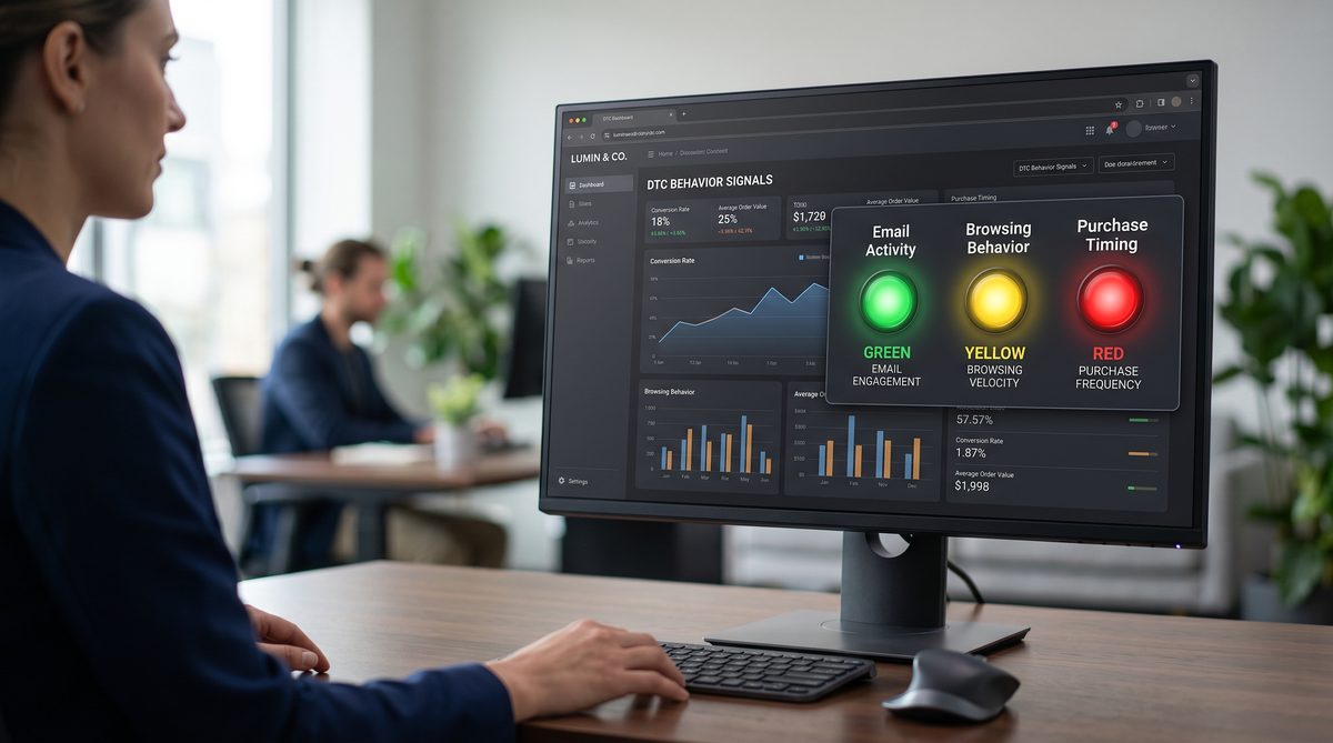
The goal is not perfection. The goal is a single screen that shows you which customers need attention today.
The NRR Connection
Net revenue retention measures how much revenue you keep and expand from existing customers. OpenView's 2025 SaaS benchmarks show healthy NRR targets by stage:
| ARR Stage | Good NRR | Great NRR | |-----------|----------|-----------| | Under $1M | 100% | 116% | | $1M-$5M | 104% | 110% | | $5M-$20M | 105% | 112% |
A health score dashboard directly influences NRR by converting churn prevention (keeping the denominator stable) and expansion identification (growing the numerator) into daily operational habits.
On submarines, we tracked reactor parameters on a watchstanding board. Every watch team reviewed the same indicators at the same intervals. Nobody waited for a casualty to check the gauges. Customer health scoring is the same principle. You do not wait for the cancellation email. You watch the gauges.
The Doctrine Connection
Systems beat slogans. "Reduce churn" is a slogan. A health score dashboard with defined signals, weighted scoring, automated data collection, and triaged response protocols is a system. The system runs whether you are in the office or on vacation. The slogan only works when someone remembers to act on it.
Frequently Asked Questions
Q: How accurate are customer health scores at predicting churn?
In the first iteration, expect 60-70% accuracy. The model improves as you add historical data. After six months of tracking health scores against actual churn and renewal outcomes, accuracy typically reaches 80-85%. The key is calibrating your weights based on real outcomes, not assumptions.
Q: Do I need a dedicated customer success team to use health scores?
No. A single founder or product manager can manage health scores for up to 100 accounts using the spreadsheet method. Above 100 accounts, a dedicated CS hire or a lightweight tool like Vitally or Custify makes the workload manageable.
Q: Should health scores be visible to customers?
No. Health scores are internal operational tools. Showing a customer their score creates perverse incentives: customers with high scores may reduce engagement, and customers with low scores may feel penalized. Use the scores to drive your team's actions, not the customer's.
Q: What is the single most predictive signal for SaaS churn?
Product usage, specifically the trend in login frequency over the trailing 30 days. A customer whose daily active users decline by 30% or more month-over-month churns within 90 days roughly 70% of the time. This single signal, tracked weekly, catches most at-risk accounts before the cancellation conversation.